Paja Training Center
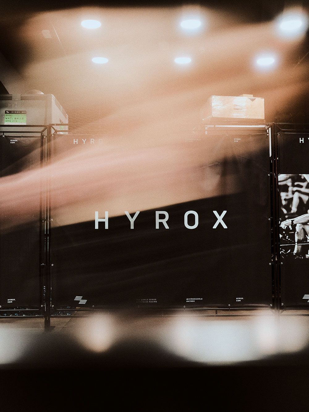
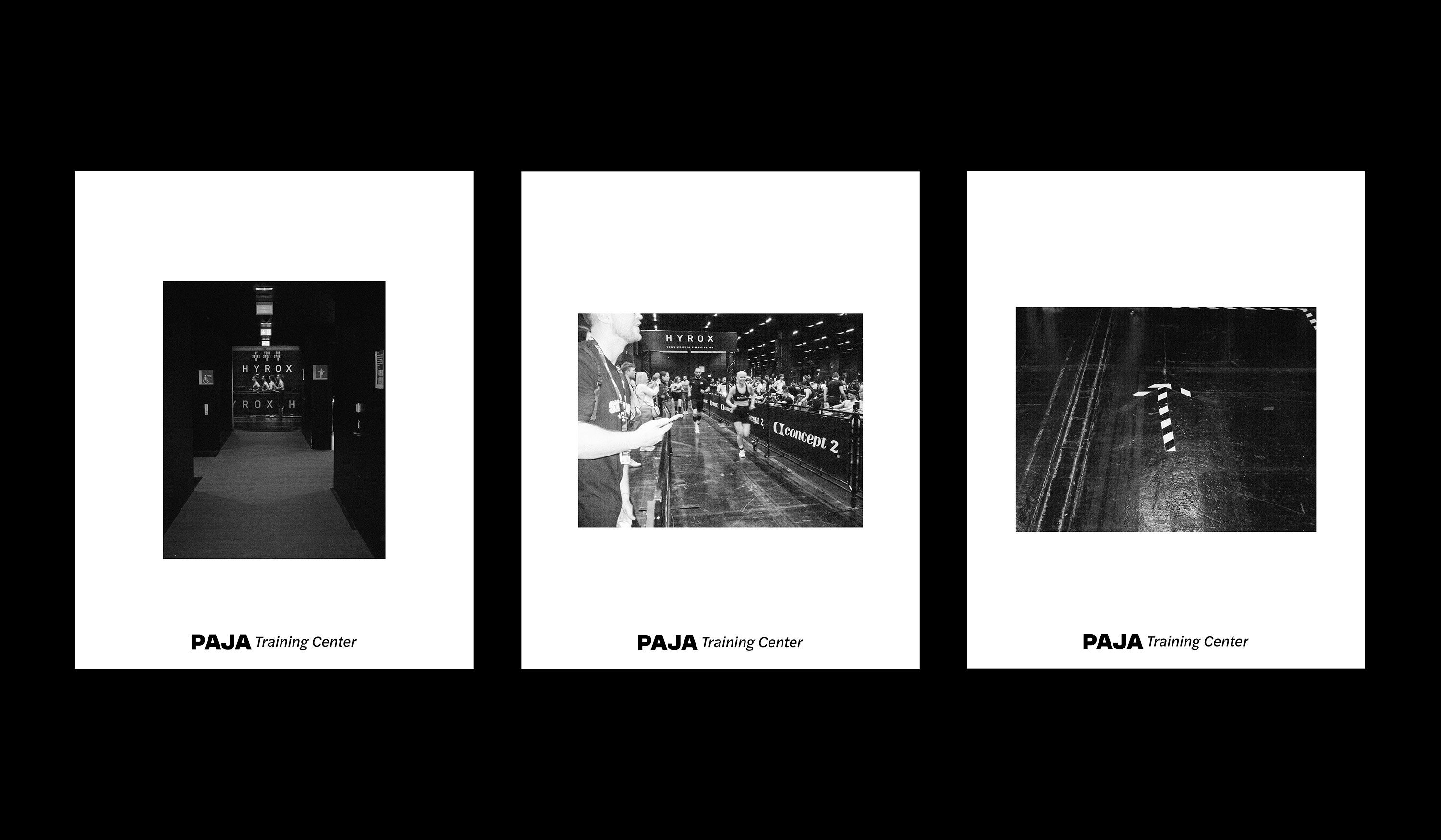
Paja brought CrossFit to Joensuu in 2016. In 2025 it became two gyms and two sports. It needed a name and an identity with room for Hyrox.
Read more
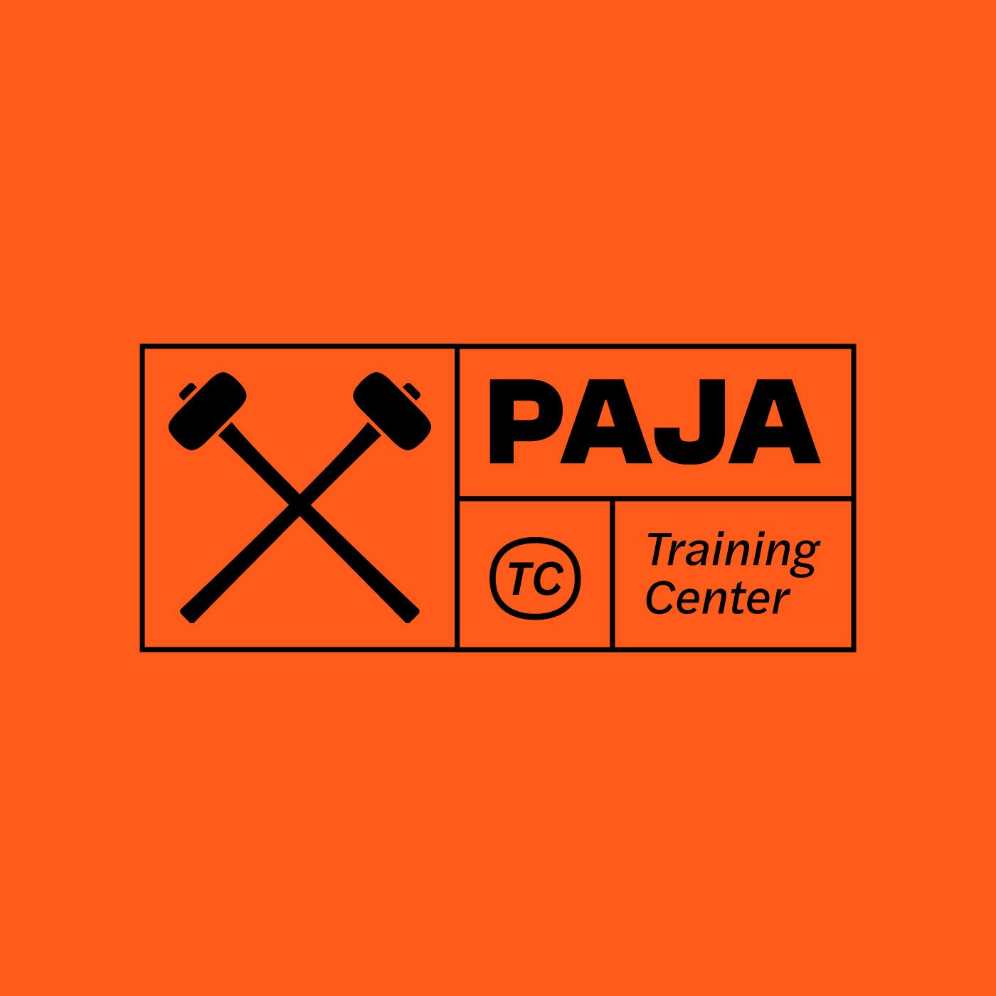
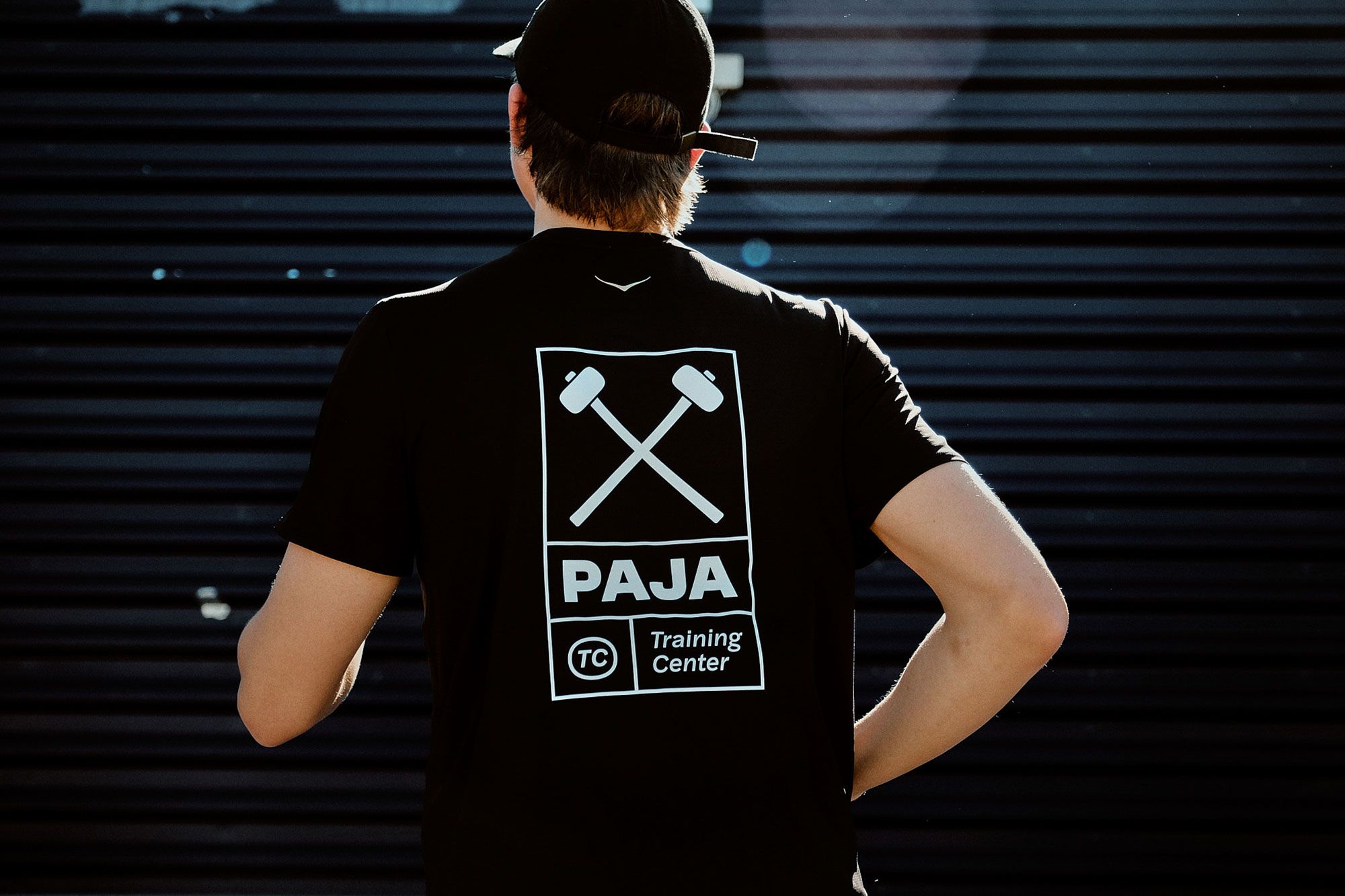
The name Paja stayed, because the people training there already knew it. After it came TC, for Training Center. Paja means forge in Finnish, and the forge gave the mark too: two crossed sledgehammers.
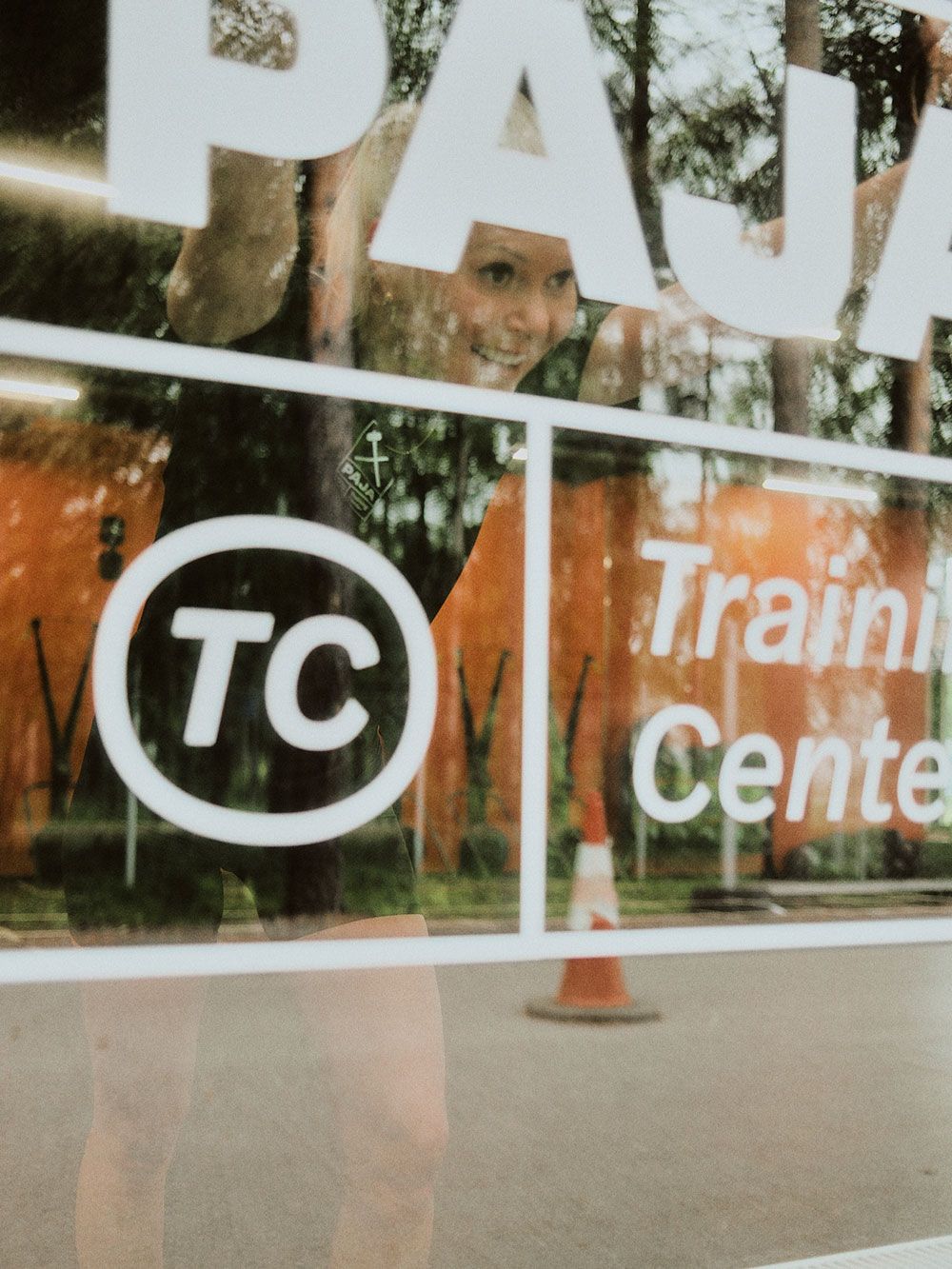
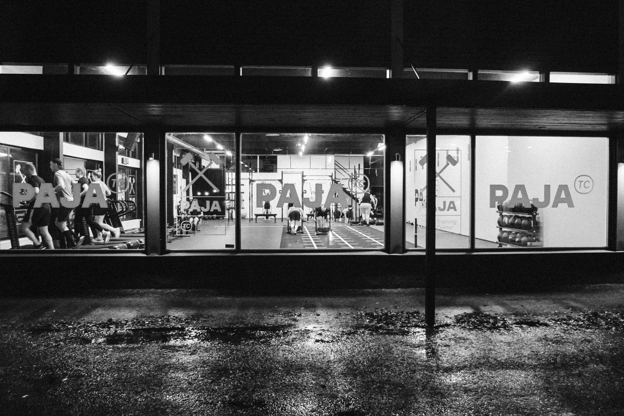
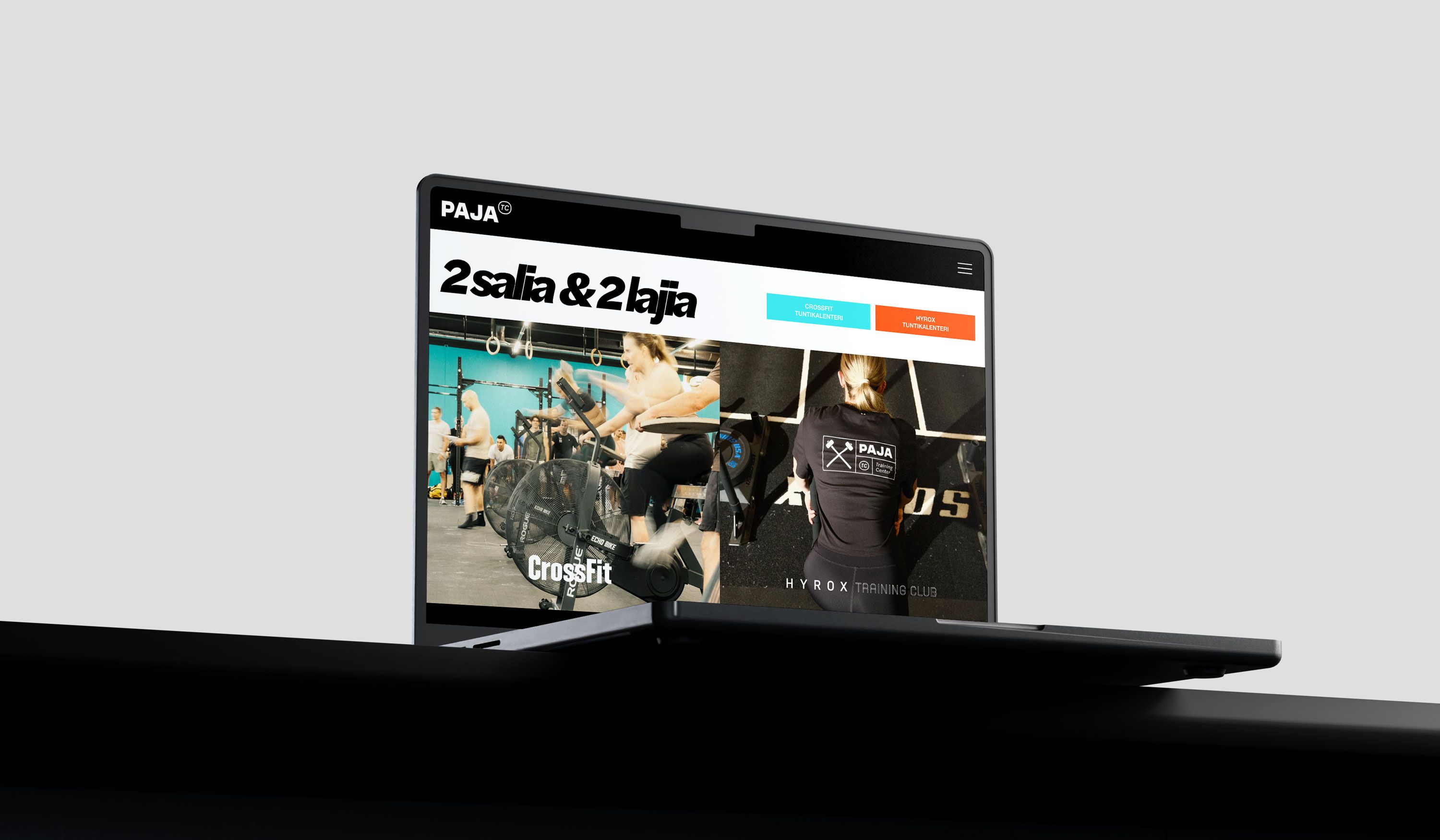
The orange wall and the black letters can be seen all the way from the street. The same identity continues in the window, on the website and on the cap. When Paja’s people head to Hyrox races, Paja goes along on the back of their shirts.
We know this client well. Vaganza’s Ilkka Kosunen is himself one of the people behind the Hyrox gym.
What we have done:
- Logo and visual identity
- Gym and window graphics
- Website design
- Clothing and merchandise
- Social media templates